Using data display with plot_data
1 - Introduction
The objective of this tutorial is to understand how plot_data, a DessIA display, works and how to create different display. We will explain to you what possibilities you have to display solution and how to use them in a simple example.
- If you are interested in how plot_data works you should read 2 - Display with plot_data.
- If you want to use post treatment in our platform, you should read 3 - DessIA's platform display.
2 - Display with plot_data
First of all, you have access to tutorial4 in the tutorials folder cloned as explained in the first tutorial. In the code where you will create class to display plot_data method, you have to import some packages.
2.1 - Display a curve in a Graph2D
First of all, we need to import some packages.
import plot_data.core as plot_data
import math
from plot_data.colors import *
Thanks to plot_data.Graph2D, you can display function. We will show you how to create one.
How to create a Graph2D ?
In order to display a Graph2D, we will use plot_data method by using 'plot_data.'. The example will be a sinusoidal function.
- Data name :
to_disp_attribute_names = ['angle', 'sinusoid']
tooltip = plot_data.Tooltip(to_disp_attribute_names=to_disp_attribute_names)#plot_data.Tooltip initialization. When you click on a point, it is information you want to see.- Data creation :
amplitude, points_number = 2, 50 #Data preparation
A1 = [i / (2 * math.pi) for i in range(points_number)]
S1 = [amplitude * math.sin(i) for i in A1]
elements1 = []
for k in range(len(A1)):
    elements1.append({'angle': A1[k], 'sinusoid': S1[k]}) #Creation of dictionary
dataset1 = plot_data.Dataset(elements=elements1, name='S1 = f(theta)',)# plot_data.Dataset initialization- Several customizations are available (optional):
point_style = plot_data.PointStyle(color_fill=RED, color_stroke=BLACK)#Point customization
edge_style = plot_data.EdgeStyle(color_stroke=BLUE, dashline=[10, 5])#Edge customization
custom_dataset = plot_data.Dataset(elements=elements1, name='S1 = f(theta)',
                                    tooltip=tooltip, point_style=point_style,
edge_style=edge_style)# plot_data.Dataset initialization with customization- plot_data.Graph2D instantiation :
graph2d = plot_data.Graph2D(graphs=[custom_dataset],
                            to_disp_attribute_names=to_disp_attribute_names)
Once done, you can display the code with the following command :
plot_data.plot_canvas(plot_data_object=graph2d, canvas_id='canvas')- You can see that the number of point depends on the zoom. However, the maximum number of point is the one you have defined with
points_number. - plot_data.plot_canvas(plot_data_object=plot_data you want to display, canvas_id='name') is the command used to display your plot_data object.
2.1.1 - How to implement this in a class
We have decided to create a Graph class that allows a sinusoidal function display. To be able to display a Graph2D in your platform, you should add a plot_data method in your class. You should import other packages.
from dessia_common import DessiaObject[Click on arrow] Graph class __init__
class Graph(DessiaObject):
    _standalone_in_db = True

    def __init__(self, amplitude: float, number: int, name: str = ''):
        DessiaObject.__init__(self, name=name)
        self.number = number
        self.amplitude = amplitude

        self.x = [i / (2 * math.pi) for i in range(number)]
        self.y = [self.amplitude * math.sin(i) for i in self.x]
    def plot_data(self):
        to_disp_attribute_names = ['x', 'y'] #axis name
        data_sets = [self.data_set()]
        graphs2d = plot_data.Graph2D(graphs=data_sets, to_disp_attribute_names=to_disp_attribute_names)
        return graphs2d
In this method, we call data_set method. At the end, we create a Graph2D which has the representation seen earlier. data_set method describes the display style : point_style, edge_style, title and axis name(to_disp_attribute_names).
    def data_set(self):
        to_disp_attribute_names = ['x', 'y']
        tooltip = plot_data.Tooltip(to_disp_attribute_names=to_disp_attribute_names)
        point_style = plot_data.PointStyle(color_fill=RED, color_stroke=BLACK)
        edge_style = plot_data.EdgeStyle(color_stroke=BLUE, dashline=[10, 5])
        elements = []
        for x, y in zip(self.x, self.y):
            elements.append({'x': x, 'y': y}) #creation of point with x and y coordinates
        return plot_data.Dataset(elements=elements, name='y = sin(x)', tooltip=tooltip,
                                 point_style=point_style, edge_style=edge_style)
2.1.2 - Graph2D with Graph class
By typing the code below in another file in another folder:
import tutorials.tutorial4_plot_data as tuto
import plot_data.core as plot_data
g1 = tuto.Graph(2, 50) #Graph(amplitude, number of point)
pdt = g1.plot_data()
plot_data.plot_canvas(plot_data_object=pdt, canvas_id='canvas')
2.2 - Display multiple curves in a Graph2D
Instead of displaying one function, we will display 2 or more functions. In our example, we will display sine and cosine function.
How to create a Graph2D with multiple functions?
You just have to create other plot_data.Dataset and add them on a new graph2D.
graph2d = plot_data.Graph2D(graphs=[custom_dataset, custom_dataset2],
                            to_disp_attribute_names=to_disp_attribute_names) #we have added one plot_data.Dataset
Once done, you can display the code with the following command :
plot_data.plot_canvas(plot_data_object=graph2d, canvas_id='canvas')2.2.1 - How to implement this in a class
This class is quite the same as Graph. The __init__ code is the same but there are 2 y lists (self.y1 and self.y2). Each function has a data_set (data_set1 and data_set2) method in order to discern each function. Same rules as Graph are applied. If you want to display more than 2 functions, you have to add as many self.y as needed and same concerning plot_data method by adapting the rest of the code.
[Click on arrow] Graphs class __init__
class Graphs(DessiaObject):
    _standalone_in_db = True

    def __init__(self, amplitude: float, number: int, name: str = ''):
        DessiaObject.__init__(self, name=name)
        self.number = number
        self.amplitude = amplitude

        self.x = [i / (2 * math.pi) for i in range(number)]
        self.y1 = [self.amplitude * math.sin(i) for i in self.x]
        self.y2 = [self.amplitude * math.cos(i) for i in self.x]

    def data_set1(self):
        to_disp_attribute_names = ['x', 'y']
        tooltip = plot_data.Tooltip(to_disp_attribute_names=to_disp_attribute_names)
        point_style = plot_data.PointStyle(color_fill=RED, color_stroke=BLACK)
        edge_style = plot_data.EdgeStyle(color_stroke=BLUE, dashline=[10, 5])
        elements = []
        for x, y in zip(self.x, self.y1):
            elements.append({'x': x, 'y': y})
        return plot_data.Dataset(elements=elements, name='y = sin(x)', tooltip=tooltip, point_style=point_style,
                                 edge_style=edge_style)
    def data_set2(self):
        to_disp_attribute_names = ['x', 'y']
        tooltip = plot_data.Tooltip(to_disp_attribute_names=to_disp_attribute_names)
        point_style = plot_data.PointStyle(color_fill=GREEN, color_stroke=BLACK)
        edge_style = plot_data.EdgeStyle(color_stroke=BLUE, dashline=[10, 5])
        elements = []
        for x, y in zip(self.x, self.y2):
            elements.append({'x': x, 'y': y})
        return plot_data.Dataset(elements=elements, name='y = cos(x)', tooltip=tooltip, point_style=point_style,
                                 edge_style=edge_style)

    def plot_data(self):
        to_disp_attribute_names = ['x', 'y']
        data_sets = [self.data_set1(), self.data_set2()]
        graphs2d = plot_data.Graph2D(graphs=data_sets, to_disp_attribute_names=to_disp_attribute_names)
        return graphs2d
2.2.2 - Graph2D with Graphs class
By typing the code below:
import tutorials.tutorial4_plot_data as tuto
import plot_data.core as plot_data
g2 = tuto.Graphs(2, 50)
pdt = g2.plot_data()
plot_data.plot_canvas(plot_data_object=pdt, canvas_id='canvas')
2.3 - Display a graph with a list of element
A ScatterPlot is used to display elements in a Graph. To explain to you how to do that, we will create a random display with different inputs. You have to import random package.
import randomHow to display a ScatterPlot ?
- Data creation :
elements = []
SHAPES = ['round', 'square', 'triangle', 'ellipse']
COLORS = [RED, BLUE, GREEN, YELLOW, ORANGE, VIOLET]
for i in range(50):
    random_shape = SHAPES[random.randint(0, len(SHAPES) - 1)] #Choose a shape randomly
    random_color = COLORS[random.randint(0, len(SHAPES) - 1)] #Choose a color randomly
    elements.append({'mass': random.uniform(0, 50),
                     'length': random.uniform(0, 100),
                     'shape': random_shape,
                     'color': random_color
})- Data name :
to_disp_attribute_names = ['mass', 'length']
tooltip = plot_data.Tooltip(to_disp_attribute_names=to_disp_attribute_names)#plot_data.Tooltip initialization. When you click on a point, it is information you want to see.- Several customizations are available (optional):
text_style = plot_data.TextStyle(text_color=GREY,
                                 font_size=10,
                                 font_style='sans-serif') #Text customization
surface_style = plot_data.SurfaceStyle(color_fill=LIGHTVIOLET, opacity=0.3)
custom_tooltip = plot_data.Tooltip(to_disp_attribute_names=['mass', 'length'],
                                   surface_style=surface_style,
                                   text_style=text_style,
tooltip_radius=10)- plot_data.Scatter instantiation :
#optional customization
point_style = plot_data.PointStyle(color_fill=LIGHTGREEN,
                                   color_stroke=VIOLET,
                                   stroke_width=0.5,
                                   size=2,  # 1, 2, 3 or 4
                                   shape='circle')  # 'circle', 'square' or 'crux' #Point customization
graduation_style = plot_data.TextStyle(text_color=BLUE, font_size=10,
                                       font_style='Arial') #Graduation customization
axis_style = plot_data.EdgeStyle(line_width=0.5, color_stroke=ROSE,
                                 dashline=[]) #Axis customization
axis = plot_data.Axis(nb_points_x=7, nb_points_y=5,
                      graduation_style=graduation_style,
                      axis_style=axis_style
                      ) #Axis creation if needed
#Scatter creation
customized_scatterplot = plot_data.Scatter(tooltip=tooltip,
                                           to_disp_attribute_names=['mass', 'shape'],
                                           point_style=point_style,
                                           elements=elements,
                                           axis=axis) # x=mass, y=shape
Once done, you can display the code with the following command :
plot_data.plot_canvas(plot_data_object=customized_scatterplot)ScatterPlot features
- + button is a zoom in, - is a zoom out.
- Z ON will allow you to select a box and you will have a zoom in on this box.
- Reset resets the view to initial one.
- S ON selects all elements in a box.
- Merge ON will merge all points that are close to each other. It is a feature automatically implemented in Graph and Graphs.
2.3.1 - How to implement this in a class
ScatterPlot class allows a display of random points in this case. In fact, you can custom this function and display a list of points.
[Click on arrow] ScatterPlot class __init__
class ScatterPlot(DessiaObject):
    _standalone_in_db = True

    def __init__(self, maximum_x: float, maximum_y: float, name: str = ''):
        DessiaObject.__init__(self, name=name)
        self.maximum_x = maximum_x
        self.maximum_y = maximum_y

        points = []
        for i in range(500):
            x = random.uniform(0, self.maximum_x)
            y = random.uniform(0, self.maximum_y)
            points.append({'x': x, 'y': y})
        self.points = points
    def plot_data(self):
        color_fill = LIGHTBLUE
        color_stroke = GREY
        point_style = plot_data.PointStyle(color_fill=color_fill, color_stroke=color_stroke)
        axis = plot_data.Axis()
        to_disp_attribute_names = ['x', 'y']
        tooltip = plot_data.Tooltip(to_disp_attribute_names=to_disp_attribute_names)
        return plot_data.Scatter(tooltip=tooltip, to_disp_attribute_names=to_disp_attribute_names,
                                 point_style=point_style,
                                 elements=self.points, axis=axis)
You can see that there is not data_set method. This method is now present in plot_data method to reduce the number of lines in the code.
2.3.2 - Scatter with ScatterPlot class
By typing the code below:
s1 = tuto.ScatterPlot(2, 2) #points created will have x and y coordinates between 0 and 2
plot_data.plot_canvas(plot_data_object=s1.plot_data(), canvas_id='canvas')
2.4 - Display link graph
ParallelPlot displays another view concerning results. Indeed, it shows relations between variables. Here, the principle in terms of inputs is the same as before, you must give two maxima too.
How to display a ParallelPlot ?
- Data creation :
elements = []
SHAPES = ['round', 'square', 'triangle', 'ellipse']
COLORS = [RED, BLUE, GREEN, YELLOW, ORANGE, VIOLET]
for i in range(50):
    random_shape = SHAPES[random.randint(0, len(SHAPES) - 1)] #Choose a shape randomly
    random_color = COLORS[random.randint(0, len(SHAPES) - 1)] #Choose a color randomly
    elements.append({'mass': random.uniform(0, 50),
                     'length': random.uniform(0, 100),
                     'shape': random_shape,
                     'color': random_color
})- Data name :
to_disp_attribute_names = ['mass', 'length', 'shape', 'color']- Several customizations are available (optional):
edge_style = plot_data.EdgeStyle(line_width=1, color_stroke=VIOLET, dashline=[]) #Edge customization
disposition = 'horizontal' #or 'vertical' if you want
rgbs = [BLUE, YELLOW, ORANGE]
# When the attribute 'rgbs' is not given to the ParallePlot
# it is set to [red, green, blue]. However, users are free to set as many
# colors as they want, as long as they are in rgb. A wide panel of rgb colors
# are available in plot_data/colors.py- plot_data.ParallelPlot instantiation :
to_disp_attribute_names = ['mass', 'length', 'shape', 'color'] #axis name
#Parallel creation
parallelplot = plot_data.ParallelPlot(elements=elements,
                                      to_disp_attribute_names=to_disp_attribute_names)
#Parallel creation with optional customization
customized_parallelplot = plot_data.ParallelPlot(elements=elements,
                                                 to_disp_attribute_names=to_disp_attribute_names,
                                                 edge_style=edge_style,
                                                 disposition=disposition,
                                                 rgbs=rgbs)
Once done, you can display the code with the following command :
plot_data.plot_canvas(plot_data_object=parallelplot)ParallelPlot features
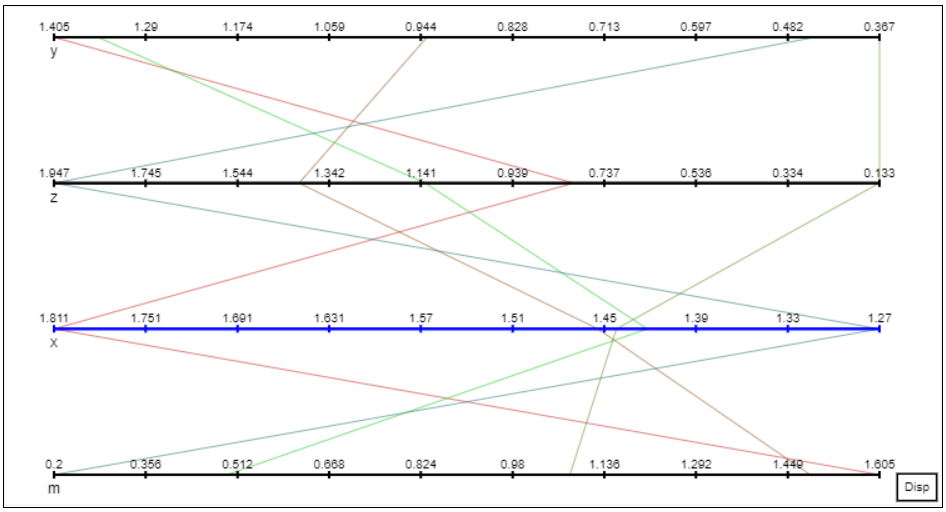
- You can drag&drop variable and switch position between them : you can click on
mvariable and switch its position withz. - If you click on a variable axis, it will display one color by way. The red one shows the way beginning with the variable maxima. The blue one shows the way beginning with the variable minima.
- You can click on variable name and it will change the maxima and minima position by reversing them.
- Clicking on Disp button on the bottom right corner will change the display from vertical axis to horizontal axis.
2.4.2 - How to implement this in a class
Here, self.points is a list of elements expressed by : {'x': x, 'y': y, 'z': z, 'm': m} = 4 coordinates. You just have to add a plot_data method in a class with display wanted.
[Click on arrow] ParallelPlot class __init__
class ParallelPlot(DessiaObject):
    _standalone_in_db = True

    def __init__(self, maximum_x: float, maximum_y: float, name: str = ''):
        DessiaObject.__init__(self, name=name)
        self.maximum_x = maximum_x
        self.maximum_y = maximum_y

        points = []
        for i in range(5):
            x = random.uniform(0, self.maximum_x)
            y = random.uniform(0, self.maximum_y)
            z = random.uniform(0, self.maximum_y)
            m = random.uniform(0, self.maximum_y)
            points.append({'x': x, 'y': y, 'z': z, 'm': m})
        self.points = points
    def plot_data(self):
        edge_style = plot_data.EdgeStyle()
        rgbs = [[192, 11, 11], [14, 192, 11], [11, 11, 192]]
        return plot_data.ParallelPlot(elements=self.points,
                                      edge_style=edge_style,
                                      disposition='vertical',
                                      to_disp_attribute_names=['x', 'y', 'z', 'm'],
                                      rgbs=rgbs)
2.4.2 - link graph with ParallelPlot
By running the following code and changing the number of elements in ParallelPlot __init__ :
p1 = tuto.ParallelPlot(2, 2)
plot_data.plot_canvas(plot_data_object=p1.plot_data(), canvas_id='canvas')
At the end you could have this :

2.5 - Display a Contour2D
PrimitiveGroup class can display a Contour2D from volmdlr (the DessIA volume modeler). You have to import some packages.
import volmdlr as vm
import volmdlr.wires as vmw
import volmdlr.edges as vme
import numpy as npy
How to display a PrimitiveGroup?
- Stylize display (optional):
edge_style = plot_data.EdgeStyle(line_width=1, color_stroke=RED, dashline=[]) #Edge customization
hatching = plot_data.HatchingSet(0.5, 3) #Hatching customization
surface_style = plot_data.SurfaceStyle(color_fill=WHITE, opacity=1,
                                       hatching=hatching) #Surface customization
circle_edge_style = plot_data.EdgeStyle(1, RED)
circle_surface_style = plot_data.SurfaceStyle(color_fill=YELLOW, opacity=0.5,
hatching=plot_data.HatchingSet())- Create element of your Contour2D, .plot_data() functions are used to convert a volmdlr object into a plot_data object :
# arc
p0 = vm.Point2D(-1, 0)
p1 = vm.Point2D(-npy.cos(npy.pi / 4), npy.sin(npy.pi / 4))
p2 = vm.Point2D(0, 1)
arc = vme.Arc2D(p2, p1, p0) #3 points on a circle arc
plot_data_arc = arc.plot_data(edge_style=edge_style) #convert volmdlr to plot_data
# square contour
rectangle_size = 1
pt1 = vm.Point2D(0, 0)
pt2 = vm.Point2D(0, rectangle_size)
pt3 = vm.Point2D(rectangle_size, rectangle_size)
pt4 = vm.Point2D(rectangle_size, 0)
contour1 = vmw.Contour2D([vme.LineSegment2D(pt1, pt2),
                          vme.LineSegment2D(pt2, pt3),
                          vme.LineSegment2D(pt3, pt4),
                          vme.LineSegment2D(pt4, pt1)])
plot_data_contour = contour1.plot_data(edge_style=edge_style,
                                       surface_style=surface_style)
# Circle
circle = vm.wires.Circle2D(vm.Point2D(6, 9), 5) #center and radius
plot_data_circle = circle.plot_data(edge_style=circle_edge_style,
surface_style=circle_surface_style)- Add Text and Label (optional):
text = plot_data.Text(comment='Hello', position_x=6, position_y=9,
                      text_style=plot_data.TextStyle(text_color=RED,
                                                     font_size=12,
                                                     font_style='sans-serif')
                      )
# This label is created with minimum information
label1 = plot_data.Label(title='label1')
# This label is created using all customizations
fill1 = plot_data.SurfaceStyle(color_fill=RED, opacity=0.5)
edge1 = plot_data.EdgeStyle(line_width=1, color_stroke=BLUE, dashline=[5, 5])
text_style = plot_data.TextStyle(text_color=ORANGE, font_size=14, italic=True, bold=True)
label2 = plot_data.Label(title='label2', text_style=text_style, rectangle_surface_style=fill1,
                         rectangle_edge_style=edge1)
#MultipleLabels
labels = plot_data.MultipleLabels(labels=[label1, label2])- Primitives assembly and display :
primitives = [plot_data_contour, plot_data_line, plot_data_arc,
              plot_data_circle, text, labels]
primitive_group = plot_data.PrimitiveGroup(primitives=primitives)
Once done, you can display the code with the following command :
plot_data.plot_canvas(plot_data_object=primitive_group)2.5.1 - How to implement this in a class
A Contour2D is created thanks to Point2D. Those Point2D are linked thanks to LineSegment2D in our case. Here, we have decided to display 6 contours with 2 inputs : x and y lengths.
[Click on arrow] SimpleShape class __init__
class SimpleShape(DessiaObject):
    _standalone_in_db = True

    def __init__(self, lx: float, ly: float, name: str = ''):
        DessiaObject.__init__(self, name=name)
        self.lx = lx
        self.ly = ly
    def plot_data(self):
        hatching = plot_data.HatchingSet(0.5, 3)
        edge_style = plot_data.EdgeStyle(line_width=1, color_stroke=BLUE, dashline=[])
        surface_style = plot_data.SurfaceStyle(color_fill=WHITE, opacity=1, hatching=hatching)

        pt1 = vm.Point2D(0, 0)
        pt2 = vm.Point2D(0, self.ly)
        pt3 = vm.Point2D(self.lx, self.ly)
        pt4 = vm.Point2D(self.lx, 0)
        c1 = vmw.Contour2D([vme.LineSegment2D(pt1, pt2),
                            vme.LineSegment2D(pt2, pt3),
                            vme.LineSegment2D(pt3, pt4),
                            vme.LineSegment2D(pt4, pt1)])
        contours = [c1]
        for i in range(5):
            c2 = c1.translation(vm.Vector2D(random.uniform(0, 2), random.uniform(0, 2)), copy=True)
            contours.append(c2)

        plot_datas = [c.plot_data(edge_style=edge_style, surface_style=surface_style) for c in contours]
        return plot_data.PrimitiveGroup(primitives=plot_datas)
2.5.2 - Contour2D with SimpleShape
By typing the following code, you have the following display :
shape1 = tuto.SimpleShape(3, 2)
plot_data.plot_canvas(plot_data_object=shape1.plot_data(), canvas_id='canvas')
2.6 - Combined plot_data method
Thanks to MultiplePlots, you can display Scatter, Parallel and other together.
How to display a MultiplePlots ?
- Data creation :
elements = []  # a list of vectors (dictionaries) that are displayed
# through different representations such as parallel plots and scatter plots
nb_elements = 50
colors = [VIOLET, BLUE, GREEN, RED, YELLOW, CYAN, ROSE]
directions = ['north', 'south', 'west', 'east']
for i in range(nb_elements):
    random_color = colors[random.randint(0, len(colors) - 1)]
    random_direction = directions[random.randint(0, len(directions) - 1)]
    elements.append({'x': random.uniform(0, 1000),
                     'y': random.uniform(0, 1000),
                     'color': random_color,
'direction': random_direction})-
Create Scatter and Parallel as explained earlier.
-
Create a PrimitiveGroupContainers :
primitive_groups = [primitive_group1, primitive_group2, primitive_group3, primitive_group4]
primitive_group_container = plot_data.PrimitiveGroupsContainer(primitive_groups=primitive_groups,
                                                               associated_elements=[1, 2, 3, 4],
                                                               to_disp_attribute_names=['x', 'y']
)- Create the MultiplePlots :
plots = [parallelplot1, parallelplot2, scatterplot1,
         scatterplot2, scatterplot3, graph2d, primitive_group_container]
multiplot = plot_data.MultiplePlots(plots=plots, elements=elements,
                                    initial_view_on=True)
Once done, you can display the code with the following command :
plot_data.plot_canvas(plot_data_object=multiplot)MultiPlot features
- First of all, go on the bottom of the display and click ViewOFF. This will colorize windows and maximize the size.you could change the dimension and the position in display.
- If it is too big, click on the false on the bottom left corner. You could reduce the size of display with your mouse and you could change the dimension and the position in display.
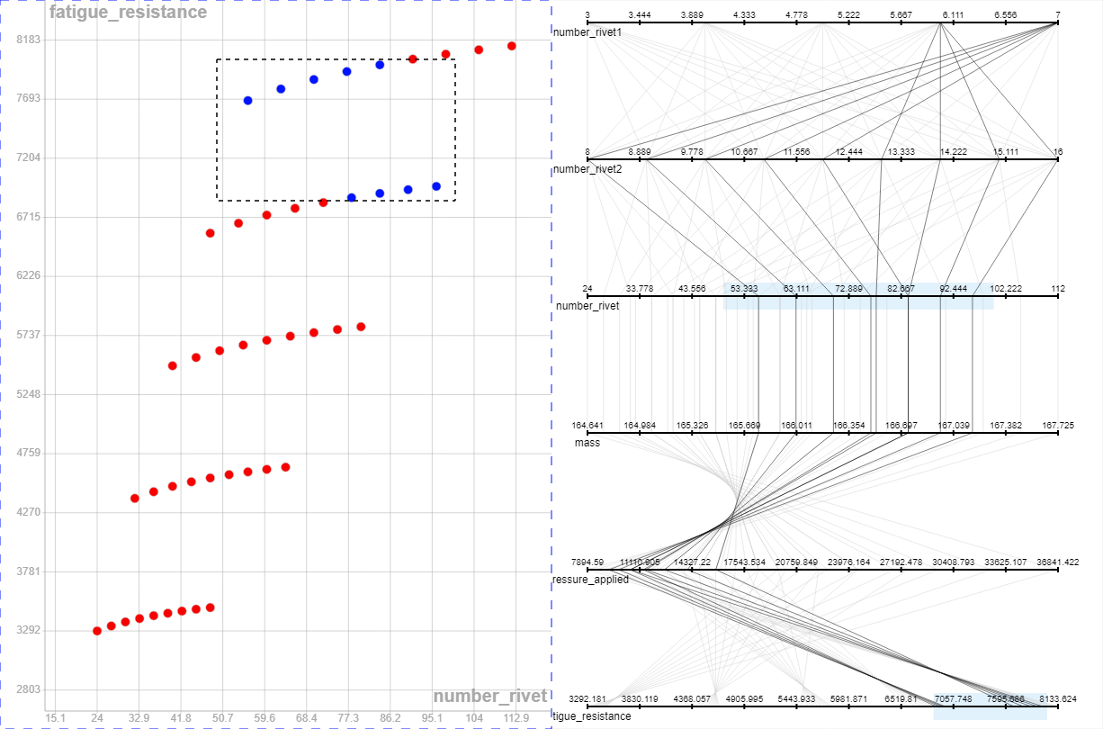
- The last button is Dep concerns the dependance between plots. Indeed, if you select a box in the ScatterPlot, it will show the combination selected in the ParallelPlot. It will create a LIGHTBLUE box in ParallelPlot and you can move it, it will move all selected point too.
- By clicking in an ParallelPlot axis, you can select a box in this axis and it will show you what points ares concerned by this selection, if Dep is activated.
2.6.1 - How to implement this in a class
plot_data method is a combination of both display. Here, the principle in terms of inputs is the same as before, you must give two maxima too.
[Click on arrow] MultiPlot class __init__
class MultiPlot(DessiaObject):
    _standalone_in_db = True

    def __init__(self, maximum_x: float, maximum_y: float, name: str = ''):
        DessiaObject.__init__(self, name=name)
        self.maximum_x = maximum_x
        self.maximum_y = maximum_y

        points = []
        for i in range(500):
            x = random.uniform(0, self.maximum_x)
            y = random.uniform(0, self.maximum_y)
            z = random.uniform(0, self.maximum_y)
            m = random.uniform(0, self.maximum_y)
            points.append({'x': x, 'y': y, 'z': z, 'm': m})
        self.points = points
    def plot_data(self):
        color_fill = LIGHTBLUE
        color_stroke = GREY
        point_style = plot_data.PointStyle(color_fill=color_fill, color_stroke=color_stroke)
        axis = plot_data.Axis()
        to_disp_attribute_names = ['x', 'y']
        tooltip = plot_data.Tooltip(to_disp_attribute_names=to_disp_attribute_names)
        objects = [plot_data.Scatter(tooltip=tooltip, to_disp_attribute_names=to_disp_attribute_names,
                                     point_style=point_style,
                                     elements=self.points, axis=axis)]

        edge_style = plot_data.EdgeStyle()
        rgbs = [[192, 11, 11], [14, 192, 11], [11, 11, 192]]
        objects.append(plot_data.ParallelPlot(elements=self.points,
                                              edge_style=edge_style,
                                              disposition='vertical',
                                              to_disp_attribute_names=['x', 'y', 'z', 'm'],
                                              rgbs=rgbs))

        coords = [(0, 0), (500, 0)]
        sizes = [plot_data.Window(width=500, height=500),
                 plot_data.Window(width=500, height=500)]

        return plot_data.MultiplePlots(elements=self.points, plots=objects,
                                       sizes=sizes, coords=coords)
2.6.2 - Combination with MultiPlot
By typing the following code, you have the following display :
m1 = tuto.MultiPlot(2, 2)
plot_data.plot_canvas(plot_data_object=m1.plot_data(), canvas_id='canvas')
3 - DessIA's platform display
When you upload a workflow or things to display, you will use different elements of plot_data. Here are the most used.
3.1 - ScatterPlot
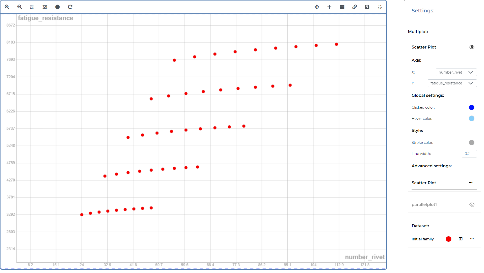
First of all, to set up the ScatterPlot, you have to double click on it. Different options are available when you do that and it is often explained when you hover your mouse over them. They are available on the top left corner.

3.2 - ParallelPlot
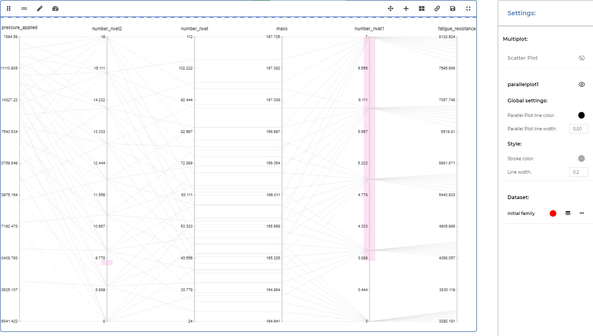
By double clicking on the ParallelPlot, you will have different options.
- On the top left corner, it changes the disposition of the axis like Disp button.
- The equal symbol (Open rubberband menu) will open 'Settings' window where you can choose a lot of parameters and particularly a selection range per variable. This range is expressed in percentage.
- The pen symbol (Open edit menu) will open a window too and you can choose what variables can be displayed.

3.3 - MultiPlot
Multiplot settings are available on the top right corner. You will find same parameters explained below concerning MultiPlot. Here are some examples:
- You can manipulate displays with Enable manipulation mode.
- You can add a plot (ScatterPlot, ParallelPlot, etc..) thanks to + button.
- During post treatment, you can create a relation between ScatterPlot points with ParallelPlot line thanks to Enable dependency. This feature creates comfort when you want to visualize a solution. For example, you first click on Enable dependency, then in a ScatterPlot, you will select a window of solution and they will be in the foreground. You will find same features explained below concerning MultiPlot.
- Save canvas as image will download a png picture of the display.
